
10 Tips for Choosing Thread Colors for Smocking
- Aug 31, 2022
- 4 min read
Updated: Jul 3, 2025

Picking floss colors is usually a fun part of the creative process for starting a new smocking design, but sometimes, especially when working on a print, it be a challenge! You would think it would be simple - just pull colors from the print and you are good to go! But often it isn't that simple, you pick colors, start smocking and find that all your hard work is just disappearing into the print - the goal is to see the smocking! Of course, the smocking should be part of creating a beautiful design and contribute to the overall aesthetic, but we still want it to be noticed! Below are 10 tips to help pick thread colors for your next smocking project. If you prefer to listen, here is the video.
But first a little story... for me, the most difficult time I had picking floss colors was smocking a bishop dress on this lovely Red Rosie Fabric.

My plan was to smock the dress in red. It was only after I had several rows done that I stood back and realized that you couldn't see all my hard work! I tried a different color of red, both darker and lighter, tried several shades of pink, and was just besides myself. I never tried the green because I didn't want this dress to read "Christmas." it was my good friend Julie who finally came up with the solution - you might not notice it unless you look closely, but those stems are a dark blue/gray and I smocked the dress with that color! So here are the lessons I have learned along the way to help pick out floss colors that will pop!
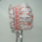
1. Pick a Floss that is lighter or darker than the print.
Pick floss colors from the print, but rather than matching the color of the print, try shades that are darker or lighter. The gray floss used on the bonnet below is darker than the gray of the fabric and it therefore stands out.
2. Assess the Print.
Prints where there is an even distribution of different colors and and equal distribution of color and back ground can be the hardest to make the smocking stand out, such as the Red Rosie above, but this coral and gray Smocked Bonnet that has much more gray than coral is easily smocked with coral flosses. A print with an uneven distribution of colors and uneven distribution of color compared to background will allow the smocking to better show.
3. Look for the hidden shade in the print.
In the Red Rosie print above, the blue/gray of the leaves are the hidden color in the print. Smocking the dress with that color allowed the smocking to stand out.

4. Pleat the Fabric before Picking the Colors.
Certain colors may stand out or even disappear once the fabric is pleated. In the coral and gray fabric above, the coral almost disappears once pleated and so the coral floss is a great choice for the smocking.
5. Stand back to Assess the Color.
Smocking is most often viewed at a distance, so make sure to stand back and see if the design is noticeable. Also view the color in natural light so that there are no surprises. The color that you picked out during that evening stitching session may look very different the next day.
6. Choose a densely smocked design to help your smocking be noticed.
A Cable stitch will show up better than a Trellis Stitch. Multiple rows of Trellis will show up better than one row of Trellis. My friend Kelli went with a dense smocking design to make sure that the smocking can be seen on this vibrant Liberty print.

7. Save Embroidered Embellishments for a solid or simple print.
Use a solid or simple check or stripe to enable embroidered embellishments such as bullion roses to stand out. Also, a denser embroidery design will shop up better than a delicate one.

8. Add a ribbon to emphasize a particular color.
If a particular color doesn't stand out when smocked, but you still want that color emphasized as part of the design, consider threading a ribbon through the smocking as I did with the smocked bishop above to feature that color.
9. For a Solid or Simple Print, choose a contrasting color that goes with the print, but isn't part of the print.
In the Findley dress below, I choose the coral color to smock on the gray and white print. Checking a color wheel is a great place to get ideas for a contrasting color.

10 Look to other Fabrics for Inspiration.
In this aqua print, the color combinations are probably nothing I would think of. But if I wanted to smock a solid aqua dress I could try the pink and purple as well as use touches of taupe and mustard.

Look to prints of all kinds in your stash or snap a photo of a print that you see when out shopping for fabric. The color combination can be your next color inspiration!
I hope these tips will help as you pick floss colors for your next smocking project, and that you won't have to rip out as I did with the Red Rosie Bishop! Happy Smocking!